I was so inspired by the recent blog post by Michelle Dortignac “The Heart of the Matter – What Message Do You Send Out To The World? (published March 13th, 2020 on aerialyoga.com) I decided to write about the meaning behind the Connecticut Aerial Yoga (CAY) name and logo.
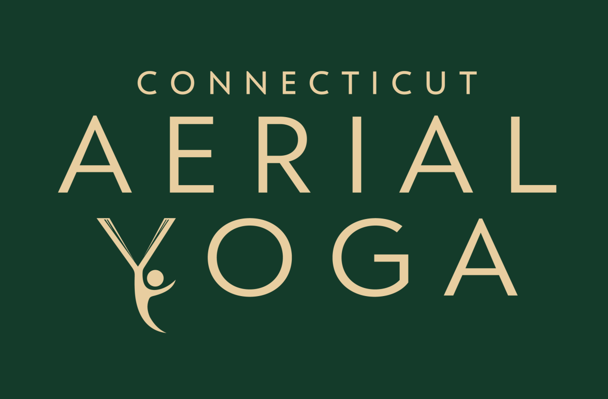
Right from the beginning, I knew that I did not want my logo to be gender specific or to convey that a particular body type is necessary to practice aerial yoga. Aerial yoga is accessible to most bodies and I wanted my logo to reflect that truth. All are welcome at CAY: all genders, all races, all body types, and all levels of experience. I settled on a gender-neutral figure, equal parts grounded and elevated, displaying qualities of grace, flow, ease and strength. The figure is shaped as a curved “Y” symbolizing that at the center of aerial yoga is yoga. Bright and lively colors express the spirit of the practice.

Now that the visual element was in place, the next step was settling on a name for my business. My husband actually came up with the name. I started teaching aerial yoga classes in 2013 in Hartford, CT. At that time, there were only two studios (to the best of my knowledge) offering aerial yoga instruction in Connecticut. Located in the center of a small state, he suggested naming my studio Connecticut Aerial Yoga.
![]()
Initially, I was reluctant to even include the word “aerial” in my business name as it implies that in an aerial yoga class we are always airborne. While many potential students are curious and eager to try aerial yoga, there are an equal number of people who are intimidated by the idea. When people discover that I teach aerial yoga, they often think that I am a circus artist (which I am) and that aerial yoga is synonymous with being an aerialist (it is not) and that the practice takes place entirely in the air (definitely not true).
It has been a consistent practice of mine, both inside and outside the studio, to educate others that aerial yoga is ‘real yoga.’ And while we do take our yoga postures into the air, the method I teach, the Unnata® Method, is a carefully developed method of Hatha Yoga incorporating the hammock prop.
The CAY logo holds deep-rooted meaning that reflects the core values behind the CAY brand. CAY values inclusiveness, union between body and spirit, balance between the ground and air, and overall delight in movement that aerial yoga provides.
I absolutely love my logo. Added bonus – it makes a fabulous T-shirt!

The CAY logo was designed by the late Paul S. Selwyn, a well-known artist, illustrator and art director in the Greater Hartford area.